Evaluation of cultural projects made easy
Making evaluations of cultural projects easy
In general, those working in cultural diplomacy tend to focus on making projects happen. Collecting and analysing data for monitoring and evaluation purposes is often seen as a challenge. A lack of time, limited expertise, or simply a lack of priority can all stand in the way. However, with relatively little effort, it is possible to gather basic project data, carry out straightforward analysis, calculate key indicators and produce meaningful visualisations. Even setting up a simple document in Excel, Calc, or any other readily available spreadsheet programme can be an effective first step towards visualising the results of your work.
This tutorial provides some easy steps to evaluate projects. For this purpose I made a simple Excel sheet that can be a starting point. Click here to download.
This will enable us to answer questions such as:
How many projects did we support?
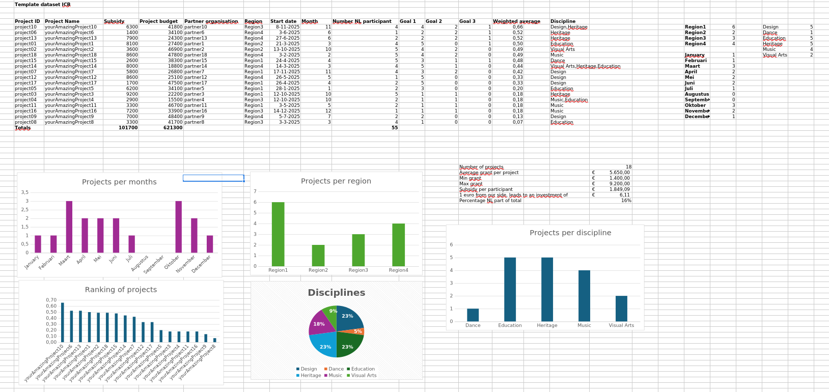
In which regions did we support projects?
How many projects took place per month?
How many projects were there per discipline?
What is the average, minimum and maximum grant amount?
How many euros did our partners invest for each euro from our side?
Which projects scored best against our policy goals?
What do you need?
A list of projects
Grants per project
Project budget (Dutch part of the budget)
Starting date
Month (enter the month as a number; Excel will convert this to the correct month).
Number of our national participants (artists, makers, …) per project
Disciplines per project
A score per policy goal, depending on how you measure a project’s contribution to policy goals.
Step 1: Define the column names. For example
Project ID
Project Name
Subsidy
Project budget
Partner organisation
Region
Start date
Month
Number of national participant
Goal 1
Goal 2
Goal 3
Weighted average
Discipline
Then comes the more tedious part: populating your Excel spreadsheet with data. Ensure that numbers are recognised as numbers and dates as dates. You can do this by selecting the relevant cells and checking ‘Format cells’. Numbers should not be treated as text; otherwise, calculations will not be possible.
All the data in this example has been generated randomly. The scores for the three imaginary policy goals could be the scores that you and your team gave to projects, or the results of a questionnaire. It depends on what is available.
The weighted average of the scores for the policy goals is calculated so that a final score between 0 and 1 is returned.
Goal 1 contains scores from 1 to 5; therefore, the results are divided by 5.
Goal 2 contains scores from 0 to 2; therefore, the results are divided by 3.
Since there are three policy goals in this example, the sum of the three scores is divided by 3.
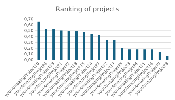
The whole table is ordered so that the weighted average column goes from highest to lowest score. This will be needed for a visualisation later.
Step 2 Aggregate results
In order to create visualisations, we need to prepare the data by grouping the required variables. Excel wants us to calculate totals by discipline, month, and so on before we can use the data for charts.
We are going to count how many times a project takes place in a certain region. I created a new list of regions in column T and used Excel’s built-in COUNTIF function to count how many times a region appears in that column. If you click on one of the cells, you can see the formula: =COUNTIF($G6:$G23;T6). This counts how many times the word in cell T6 (which refers to ‘Region 1’) is present in the column from G6 to G23. You can use this format for other aggregations, of course.
For disciplines, I changed the formula slightly to ensure that cells containing multiple disciplines separated by commas are counted individually. This formula is similar to that used to count the number of regions, except that it separates words divided by commas: =COUNTIF($P$6:$P$23;"\*" & W6 & "\*"). Here, “W6” refers to “Design”, and Excel looks in the P6–P23 column. Enclosing the W6 cell between stars and ampersands lets us count occurrences in cells with multiple results.
The procedure for the months is the same as for the regions. Again, make sure that the months in column I are stored as dates (you can do this by changing the cells’ format).
Step 3: Perform some basic calculations
Excel has all the basic functionality required to calculate averages, minimums and maximums. We will use this for grants. For example, the average grant is calculated using the formula =AVERAGE(D6:D23) in the “Subsidy” column.
Step 4: Visualise the results
Visualisations such as bar and pie charts are powerful tools for revealing the stories hidden in data. The Insert pane in Excel offers plenty of charting solutions. I have included some examples. The procedure is essentially the same for all of them.
First, select the data you want to use; for example, the disciplines and their scores.
Then click on the type of chart that you want in the ‘Insert’ pane, for example ‘bar chart’.
Excel will then generate the visualisation.
There are many options for fine-tuning the presentation of a chart. You can change colours, headings, and so on, depending on your use case. Excel also has a built-in feature “Recommended Charts” that assists the user selecting the most suitable chart.
Step 5: Conclusions
Even this short data sheet demonstrates that meaningful visualisations can be generated to show the results of the work carried out. By examining the responses gathered through the sheet, we were able to address all of the questions.
How many projects did we support?
18 Projects
In which regions did we support projects?
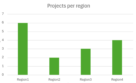
How many projects took place per month?
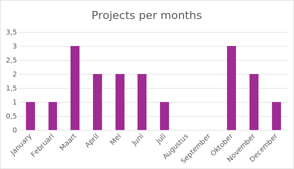
How many projects per discipline?
What is the average grant amount, the minimum, and maximum
Average grant per project € 5.650,00
Min grant € 1.400,00
Max grant € 9.200,00
How many euros did our partners invest for each euro from our side?
€ 6.11
Which projects scored best against our policy goals?
I hope this worksheet has served as a helpful example of how, with minimal effort and only a basic understanding of data analysis, you can begin collecting meaningful information about a cultural diplomacy programme. The data itself is not an end in its own right; rather, it provides a starting point from which you can tell the story of your work and demonstrate how your particular programme of projects has contributed to your wider objectives.